The world’s most liveable city got a new look
Vienna, the capital of Austria, has been rebranded – a new visual identity and brand strategy that aims to serve its citizens, as well as its increasing number of tourists.
The city has been ranked as one of the most liveable cities in the past years, also in 2018 as the most liveable city in a global survey. One of the reasons is Vienna’s numerous green spaces which also include beaches located in the city center or vineyards on Viennese hills that offer magnificent views of the city. Not to mention its low crimes rates and free healthcare and university education.
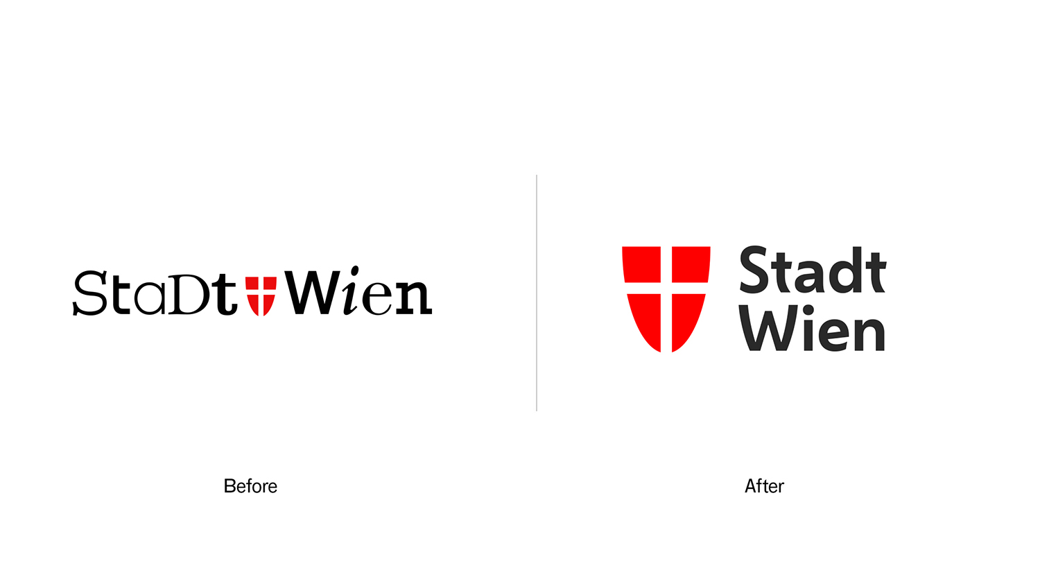
The city of Vienna assigned the design agency Saffron with the task to freshly equip the city and its sub-brands with a new look. So this is how the old identity of “Stadt Wien” / City of Vienna has been redesigned: From a logo with mixed styles to a decent clear and recognizable font.


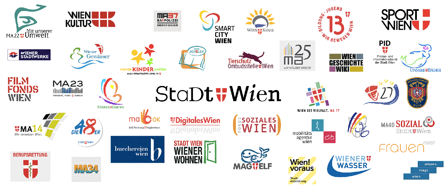
The challenge in creating a new identity and developing a brand strategy for Saffron lied in the complexity of the task: With over 70 departments and inconsistent sub-brands, the city’s positioning had become complicated and inefficient.

Saffron brought the identity under one roof with a new font called Wiener Mélange and consistent design for almost all of the 70 sub-brands – except for strong brands like “Die 48er”, the Viennese rubbish collection service. The old font featured letters set in many different typefaces and font styles – from bold to sans-serif to lower and uppercase – probably wanting to represent diversity.
The red shield with the white cross – the coat of arms of Vienna – of the old logo has been redesigned as well and adapts to the font style. It has been inspired by the lettering found on old historic Viennese buildings.
Saffron worked closely together in workshops with as many stakeholders as possible to find out the perceptions and key themes of the city: Der Mensch in der Mitte / Humans at heart.
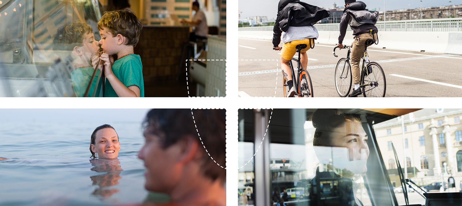
The Viennese coat of arms has become the fun and catchy icon of the city’s identity: The four quadrants offer flexibility and variety in style to the city’s new brand: One of its quadrants can turn into a holding shape for messages or transform into objects.
![]()
![]()
![]()
![]()