The signs of Vienna: A city tour with Vienna City Typeface
The Austrian capital is world renowned for it’s phenomenal amount of landmark buildings. When you stroll through the first district, it catapults you back into the time of the Habsburg empire, once one of the most influential rulers in Europe. Off the well-trodden tourist trails, there is another side of the old Vienna to discover. The city has a rich history of storefronts and signs. Forward Magazine compiled a list with the 10 must-see signs in the inner city of Vienna under guidance of the Viennese sign expert Vienna City Typeface. You should pay these storefronts a visit, if you want to listen to a different story of your city. Put your walking shoes on and let’s go.
Our lovely tour guide was Vienna City Typeface. Behind that name stands the Viennese sign enthusiast Achim Gauger. He collects the history of storefronts and signs of Vienna on Instagram under the name Vienna City Typeface. He’s also the co-founder of Vienna’s one and only Sign Week. Achim showed us the following ten hot spots for sign enthusiasts and all those who want to become one.
1. Blumen Matern
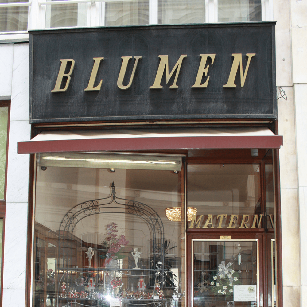
The first stop of our tour is one of Achim’s favorite entrance portals in Vienna. It impresses with its simplicity that derives from the uniform font of the sign and the big space around the single letters. Blumen Matern doesn’t use the whole available space but gives the lettering room to breath. Also, the store doesn’t have obtrusive neon letters to attract customers. Only the slope of the surfaces – a very common feature of entrance portals from the 1960ies and 1970ies – create a pulling effect to bring people into the shop.
2. Schwarzes Kameel
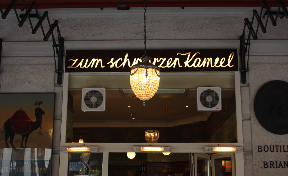
The Schwarze Kameel is one of the most famous restaurants and bakeries in the first district of Vienna. Achim points out that its takeover of the adjoining City Confiserie is an example for the incorporation of old entrance portals in the Austrian capital. Rather than building around the sign and the history of the former confectionery, the Schwarze Kameel only tried to preserve its own trademark, the handwritten neon letters. Today it’s impossible to tell where the City Confiserie used to be.
3. Buchhandlung Manz
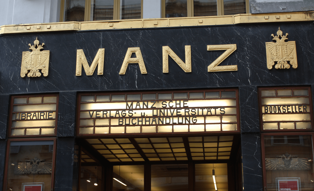
The entrance portal of the bookstore Manz is one of the most impressive works of Art-Nouveau-architect Adolf Loos in the heart of Vienna. Loos was opposed to the richly ornamented storefronts of his time. But the font of the bookstore seems to contradict his beliefs to a certain degree. He used rectilinear letters, but incorporated ornaments into the single letters to complement the surrounding marble of the facade.
4. Kammer Uhrmacher
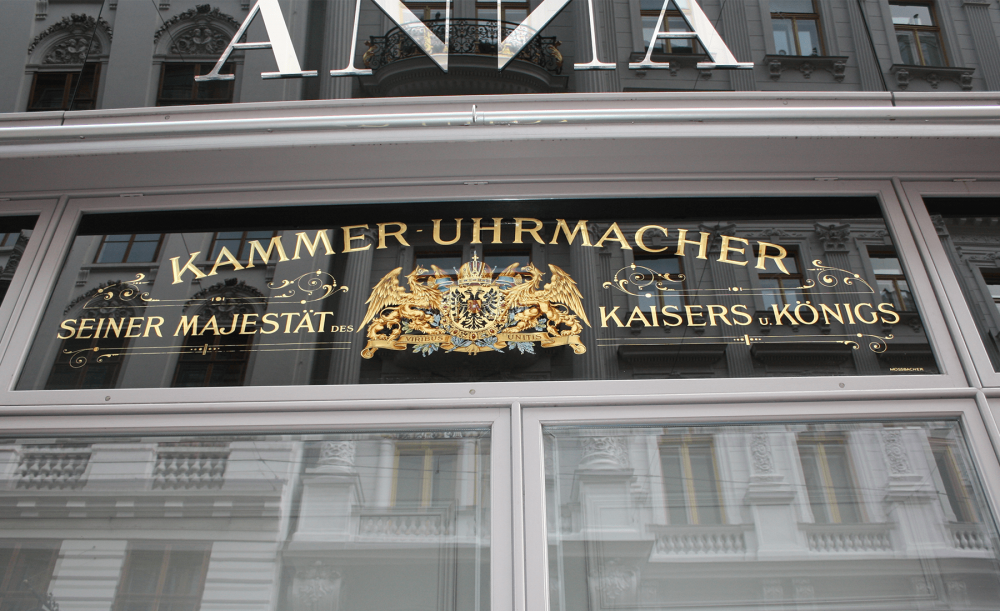
Right across the bookstore Manz is the former shop of the watchmaker of the king. The present shop owner preserved the old sign and put it in the focus of his storefront. The reason may be the uniqueness of the sign. It is made of glass and hand-painted. You can tell by the fact that the name of the artist is written at the bottom of the sign. The original painter or the last artist, who edited the sign, always places his name there.
4a. Breitling shop
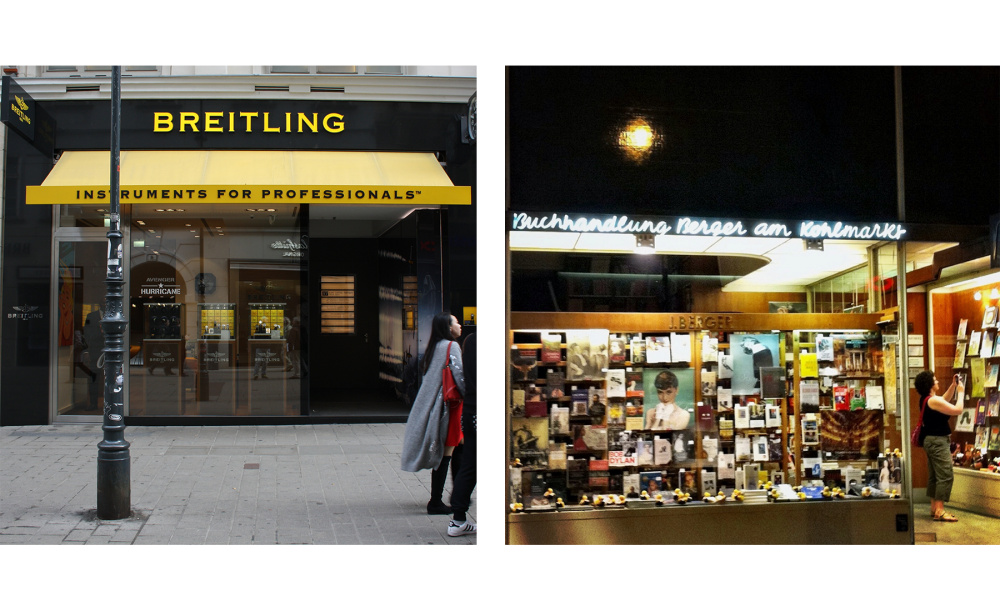
An example for the careless handling of the sign history of Vienna can be found further down the street. The former bookshop at the Kohlmarkt (picture on the right) was taken over by Breitling. The Swiss watchmaker bought the business after the death of the former owner and transformed it into an unoriginal shop. This alarming development can be seen around the city, especially in the first district, Achim explains. In the inner city, luxury brands take over businesses and rebuild them according to their company guidelines. They don’t care about the historical relevance of the shops. The result are shopping streets that are interchangeable. The customer doesn’t know anymore, if he is in Vienna, Shanghai or Abu Dhabi, Achim complains on our tour through Vienna.
5. Handschuh Christl
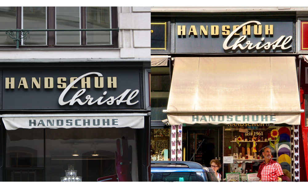
The storefront of the glove shop Christl is a reminiscence to the business portals of the 1950ies. Back then, big letters and a curved font were in fashion. The glove shop Christl is an example of how big effects can be created with simple means, like the mix of two different fonts.
6. Rudolf Scheer
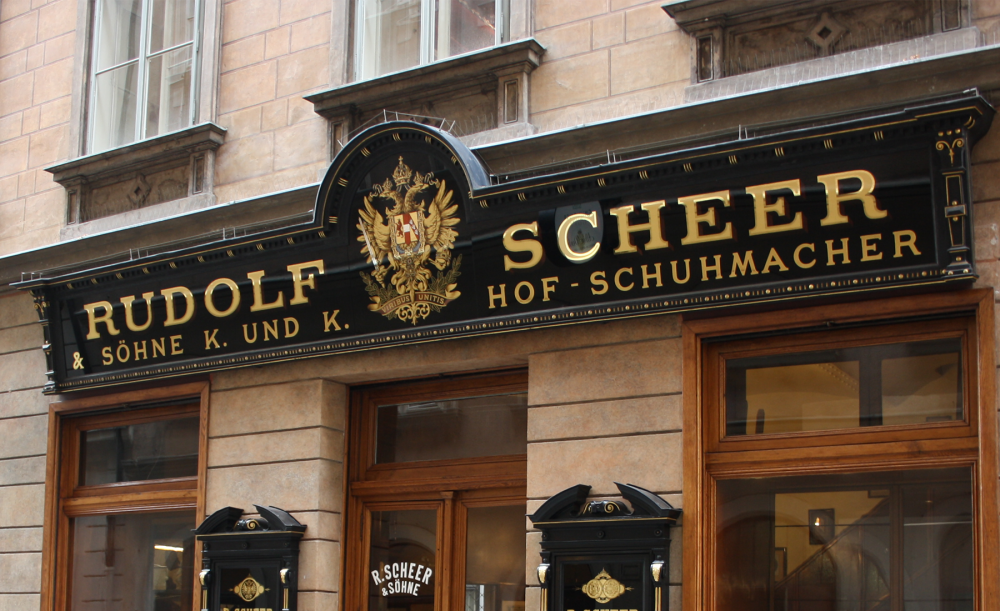
The family establishment is well-known under sign enthusiasts all around the world. The storefront of the former shoe maker of the king was not changed since 1878. The owner values the building facade very much, Achim remarks, while we stand in front of the shop in the Viennese Bräunerstraße 4. A big sign with the kaiser logo is placed above the storefront. Two small signs on the right and the left of the entrance complement the overall impression. They are designed in the same style – a black background with golden letters – as the big sign and draw the attention to the entrance door. A contrast to the storefront is the sign on the upper right side. It shows a boot and uses a golden background as well as a different font as the remaining business portal.
7. Pelze Urschel
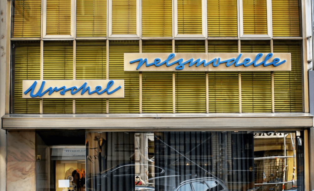
A sign that may soon be disappeared from the eyes of the public is the font of Pelze Urschel. The fur shop will probably close in 2018. The special thing about the storefront is the interplay of the windows, blinds and signs. The rectangular windows and the horizontal lines of the yellow blinds create a geometric pattern that contrasts the curved letters of the font.
8. Zum Jockey Club
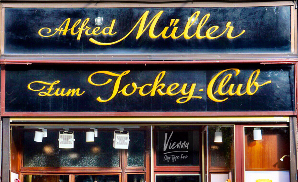
Before the first World War, the jockey club was located in the opposite building, the Philip-Hof, which was destroyed in an air raid in 1945. It was a meeting place for the rich and famous of the city. The shop owner has picked up the story and incorporated it into the name of the shop. That’s the reason why it’s called “Zum Jockey Club.” The storefront convinces with its simplicity. The curved font creates a dynamic that gives the entrance portal a playful touch.
9. Spielwaren Carl Hilpert
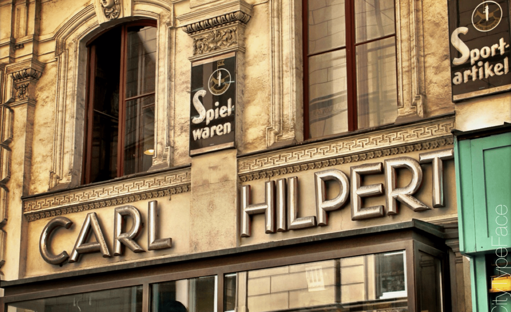
Behind the Stephansdom is one of my favorite storefronts of Vienna. The little details of the toy shop’s storefront, like the repeated logo on the columns and the small hand-painted signs, create an astonishing overall impression. The hanging letter P in the big sign in the center of the facade stands out, but actually has no deeper meaning. The inclination is the result of a construction accident.
10. Fleischerei Kröppel Josef u. Söhne
The end of the tour is a little butcher in the Postgasse in Vienna. We owe it to a great coincidence that the handwritten sign works again. The sign was in need of renovation, but the proprietress could not afford it. While handymen worked on the building, they damaged the sign. As a result, the insurance company paid for the renovation. The sign, by the way, mimics the handwriting of the butcher and is thus unique in Vienna.