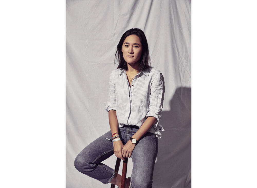
Behind the scenes with Erica Dorn
From doing corporate design to creating film graphics for Wes Anderson real quick! As a stickler for details, Erica Dorn didn’t have to think twice when the director asked her to design for his masterpiece Isle of Dogs and then again for Anderson’s latest strike The French Dispatch. In our interview with her, Erica Dorn dives deep into the working and creative process of The French Dispatch, explains how she manages to stay true to her personal design style and about making the film industry (visibly) more female.
How did you first get into film graphic design? What fascinates you about it?
I started off doing “real” design, mostly in luxury/property/aviation, but I was feeling a little stuck in an industry that was oversaturated with middleweight graphic designers. I went freelance and after a while of doing small projects on my own, I was invited to interview for Isle of Dogs because of my Japanese background. It wasn’t a path I was consciously driving towards, but I think it happened at a time when I needed something different and was open and receptive to new opportunities.
What I love about it is being able to take part in a collective work of art with a lot of talented people working at the top of their respective fields.
Can you tell us more about how you kick off a big project like “The French Dispatch”? Do you spend a lot of time researching or is it a lot of trial and error?
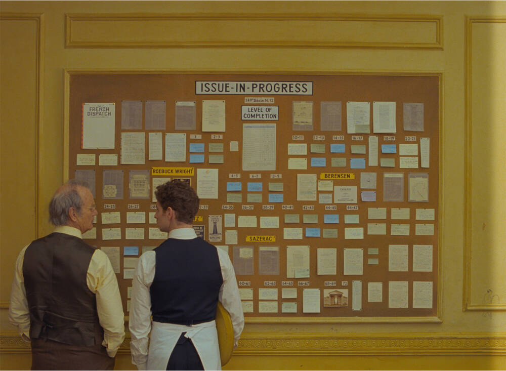
The first stage is dissecting the script and creating a breakdown (spreadsheet) of all of the graphics that might be required, categorized by department (action props, set decoration, costumes, etc). We then add to that list by studying any storyboards and animatics that are available, so that we can plan as much as possible in prep. Of course, there will always be last-minute requests, which are part of the job and probably one of the most difficult aspects.
Whenever possible we try to base our designs on real historical examples and we spend a lot of time on research to have as much material as possible. Part of the skill is in identifying what’s interesting or significant in a reference and translating that into our own designs, folding them into our own story.
What’s your workflow like?
It differs from graphic to graphic, but more often than not, it’s about finding the right references. Once I find the perfect one, that’s almost half the job done. After that, I create a couple of original designs (between three and five) to send to the director or production designer for notes. Sometimes it’s approved on the first pass, other times there are revisions, and in some cases, I’m sent back to the drawing board. Eventually, when a design is approved, we then need to figure out how to make it, whether it’s fabricated in-house or outsourced, paying very close attention to details like paper stocks and finishes. This stage often requires a lot of creativity because we often have to make multiples of something if it’s an action prop, or huge quantities of things like floor tiles, wallpapers and carpets. Often it’s a lot more time-consuming than the actual design.
What is your favorite prop from “The French Dispatch” and why?
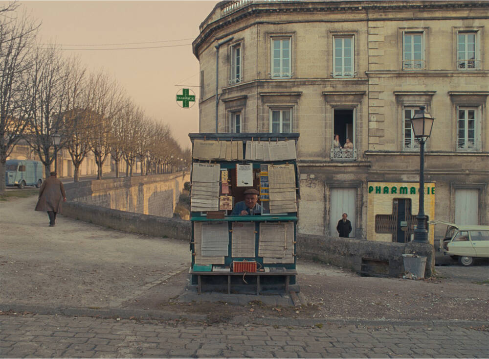
I think it might be the cigarette packets. Wes Anderson wanted them to be called Gaullistes (a nod to the classic Gauloises, and maybe also to the late President Charles de Gaulle) and they are painfully (and playfully) French. Quite unusually for a prop, the one design was used throughout all of the different stories, including flashbacks and “future” scenes even though they spanned very different decades.
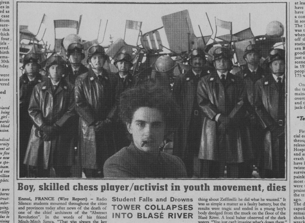
The movie is set in the fictional town of Ennui-sur-Blasé and different spots around town. How did you go about building an immersive look and feel for an entire city?
It was mostly filmmakers and photographers that informed that look and feel. Wes draws a lot of influence from the films of Tati, Truffaut, Mamoulian, Godard and Lamorisse. They inspired not just graphics but also production design, costume design, and cast.
We also drew a lot of inspiration from images by a photographer called Charles Marville, who took beautiful images of Paris in the 19th Century that had beautiful hand-painted signage and lettering. For products and brands, we aren’t informed by specific artists or designers, but by actual products and brands that existed at the time.
A majority of Wes Anderson’s fanbase is very design-affine – do you feel more pressure while working on those projects?
Sure, but I think the fact that Wes is very heavy-handed with his quality control means that there is a lower risk of us ending up creating something boring or cliché. I never create something in a vacuum, so for everything I create, I obviously share the credit with Wes and Adam, who is the production designer on The French Dispatch, and it also goes the other way – when someone criticizes the kerning or any other design choice on a particular graphic, I don’t take it personally because I know that’s exactly how Wes intended it to look.
Working as a film graphic designer you have to adapt your style to the movie’s aesthetics. How do you manage to be adaptable while also contributing to your personal style to it?
I think I’m very lucky that my aesthetic sensibilities are compatible with Wes’s. Throughout the past five or six years, I’ve learned to see a draft and judge it the way Wes would – or at least to get quite close so that we have less work to do from there. A lot of the decisions I make now are instinctive, but that instinct is built up from years of passing designs back and forth, so I know if he’s going to find something difficult to read, or too bare-bones, or not interesting enough. I think that’s true of most of us who have worked closely with Wes for many years, and maybe part of the reason why he prefers repeat collaborations. But of course, he still surprises us constantly, which is great.
Do you think one’s personality is reflected in the design one creates?
Sure, and maybe not just personality, but our cultural history, training, and aesthetic sensibilities. But I think even before we start designing, it starts by being reflected in the references we select, and the sources we choose to be inspired by.
Have you ever struggled with a lack of motivation? If so, how do you tend to cope with that?
Yes, all the time. I struggle especially when I have too much time to complete a task. That usually isn’t the case on a film though! It’s usually the opposite – there’s a high risk of burnout and fatigue. When I need a fresh injection of motivation I find that spending some time on set really helps. Usually, we work from an office nearby and don’t get to see all that goes on, but when we do get to see the magic of filmmaking in the flesh, it reminds me of what we are creating and how magical it all is.
The creative field, especially the movie business, is mostly dominated by men; is it hard for you as a woman to work in that field? Have you ever felt discriminated against or less respected because of your gender?
I think it’s true that men have the most visible jobs – director, camera/sound/grips are mostly men, and they are “on set” and therefore more present in behind-the-scenes footage. But in my last couple of productions, the set decorator and her team were almost entirely female; draftspeople (the ones drawing up the plans for the sets) are quite balanced male/female and the graphics departments lean mostly female as well. Not to mention costumes and hair-and-makeup. Maybe what we need to do is hold more value for those less visible roles, that play a huge part in the making of the film.
If there was anything you could change about the creative industries, what would it be?
Better hours and fairer pay! A better work-life balance would be great.
What’s next for you?
Hopefully a few more movies, then something a little kinder to my mental health.
Erica Dorn is one of our speakers at Forward Festival Berlin on September 22nd-23rd, where she will be talking about first-hand graphic design experience for films.